
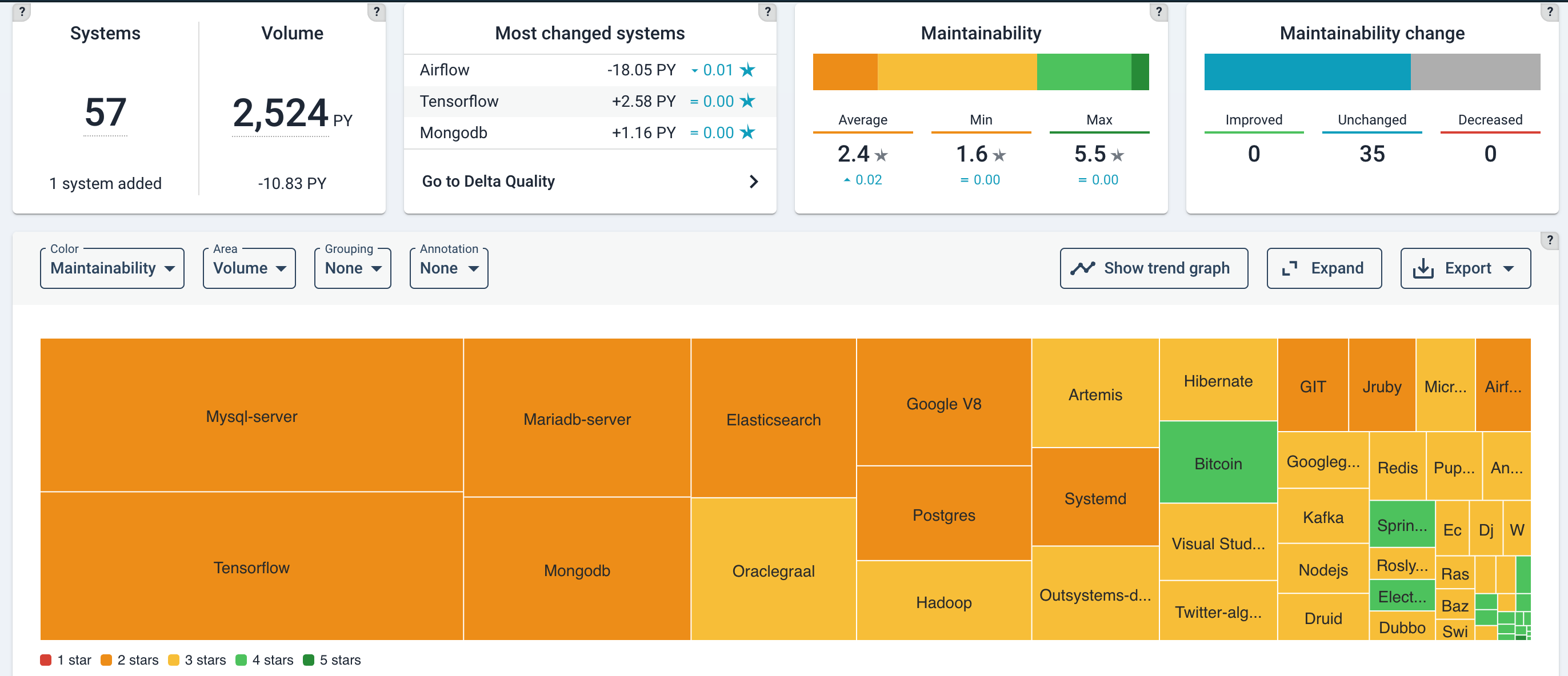
Portfolio-level maintainability
The maintainability overview page summarizes the (change in) volume and maintainability for each system in your portfolio.
To gauge portfolio health and portfolio trends, example analysis questions are:
- Is the portfolio balanced with business objectives and (enterprise) architecture roadmaps?
- Do some systems appear to be in trouble while they should have a long life ahead of them? Are quality trends heading in the right direction?
- Which direction is technical debt moving? Does this impede developers to support the business with sufficient speed and quality?
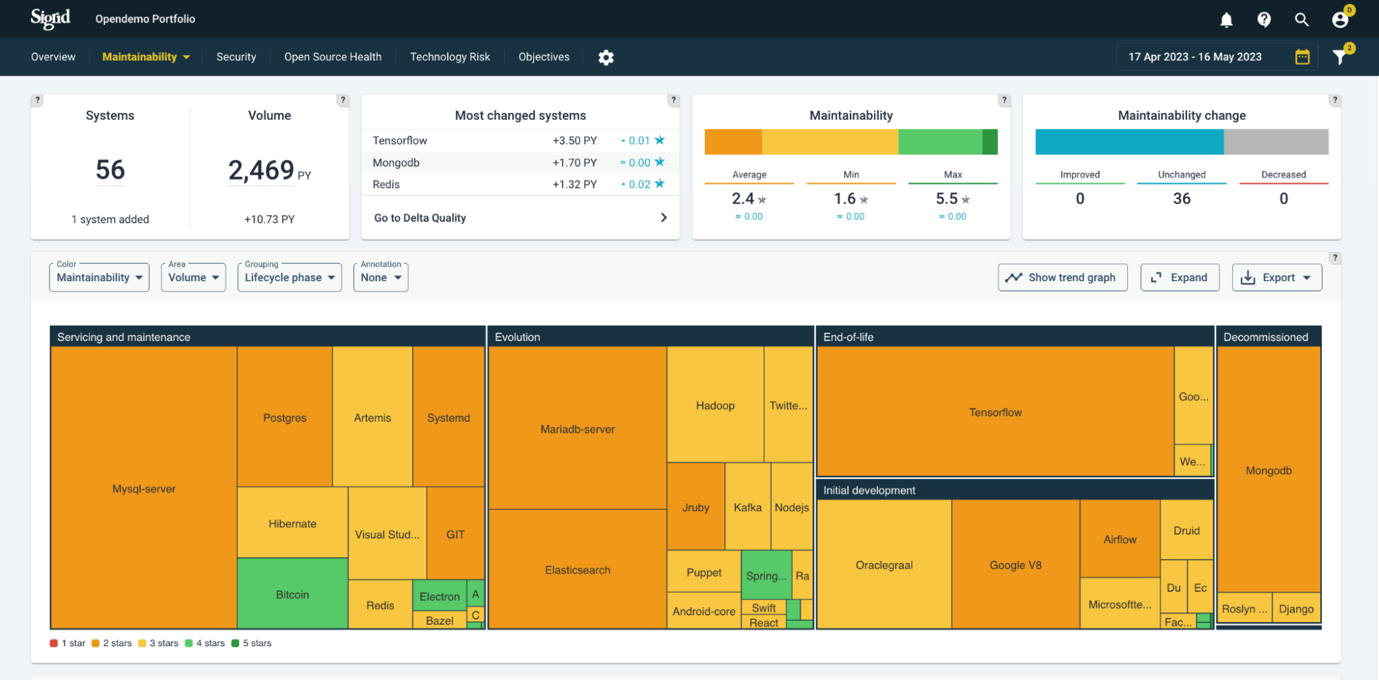
Portfolio view by system lifecycle phase
Below, systems are grouped by lifecycle phase. A lifecycle phase is an indication of a system’s maturity and “adaptability needs”, their expected path of continuation. They range from: Initial development > Evolution > Servicing & maintenance > End-of-life. You will generally expect to see a higher maintainability for younger systems (Initial development and Evolution), because they have a long time of changes ahead of them. Lower code quality early on in a system’s life will hurt more over the long term than it would for a system that is already considered “end-of-life”. Setting this lifecycle metadata is discussed in the metadata page, or specifically its section on the Sigrid API metadata end point page.
 The “?” help buttons explain the meaning of the different types of settings.
The maintainability ratings expressed in (rounded) stars are distinguished by “traffic light colors”, ranging from red (1 star) to green (5 stars).

Note that the snapshots dates in the top-right corner always imply a period, but it will assume the last date as a state, unless you select a viewing option that shows change, such as “Maintainability change”.
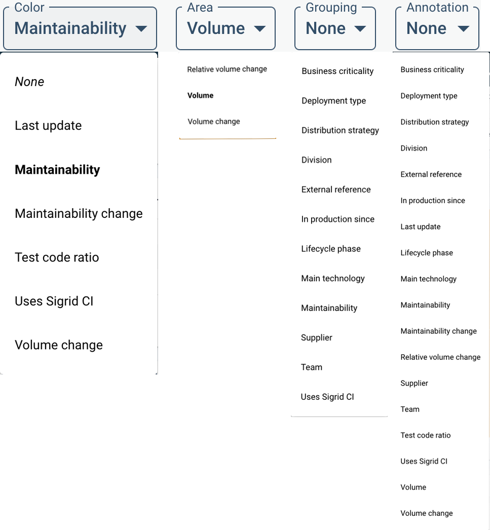
Portfolio view menus
You can create different views by system characteristics. The characteristics under Grouping and Area will change the ordering and size of the systems within the treemap. Color and Annotation will add extra information on top, as a color scheme or annotation. A complete menu of viewing options is shown below.
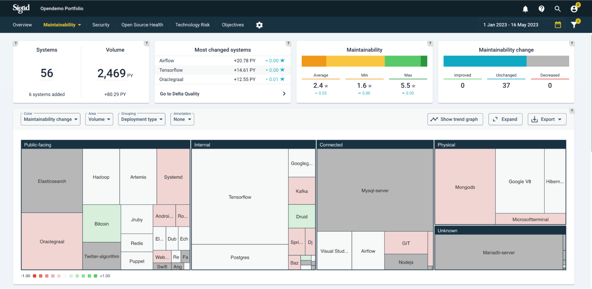
Here, “Maintainability change” is chosen as the meaning of the color scheme. The relative changes are colored as white (neutral) up to green (improving) and red (deteriorating), based on the period selected above (in this example, Year-To-Date/YTD). This can be useful as trend analysis, comparing to expectations. Generally, you would expect public-facing systems to be more actively maintained because outside users tend to come up with new requests, bug reports, and requirements for e.g. stability. As a simplification, you would expect actively maintained systems to not (or very little) deteriorate in code quality. Switching between views of “Maintainability change” in different grouping will give you an idea of the balance between expected- and actual trends.
You can filter per division/team/supplier on different quality aspects, and track the trends of each.
Trends in the context of objectives
Whether quality trends are heading in the right direction does depend on context/goals. The expected quality direction is not necessarily only upwards, but could be: restrict deterioration, stabilization, or cutting volume as a priority. This is why quality objectives are important. System-/portfolio quality overviews and their standing on helps getting a shared understanding and commitment towards quality of systems and the portfolio.
Using quality trend lines
On a trend line, quality trends can help you see movements over time, possibly fuelled by specific (renovation/development) events. In the below example, a portfolio’s code quality over time is shown per system.
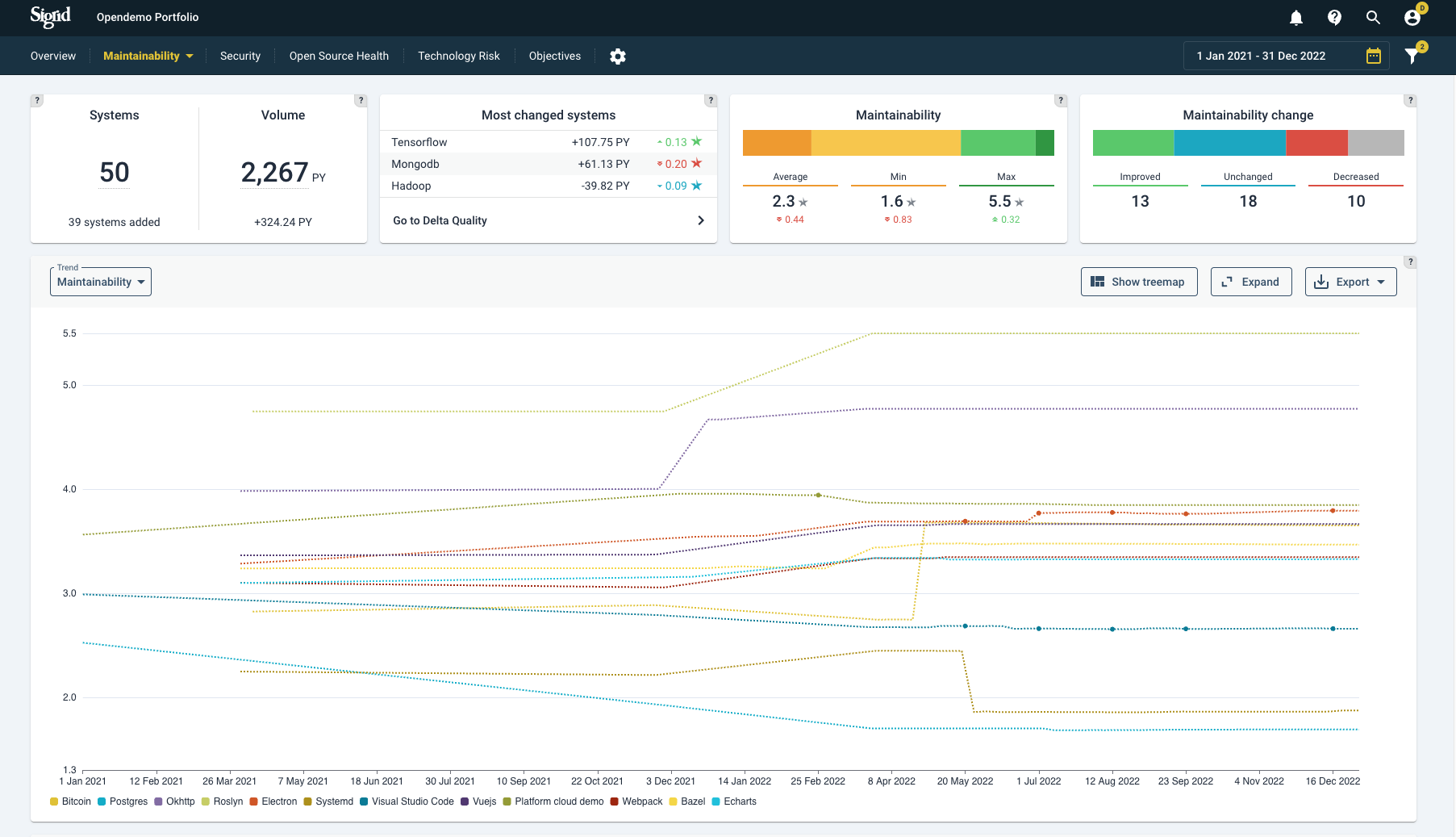
Systems can be (un)selected on the bottom of the graph.
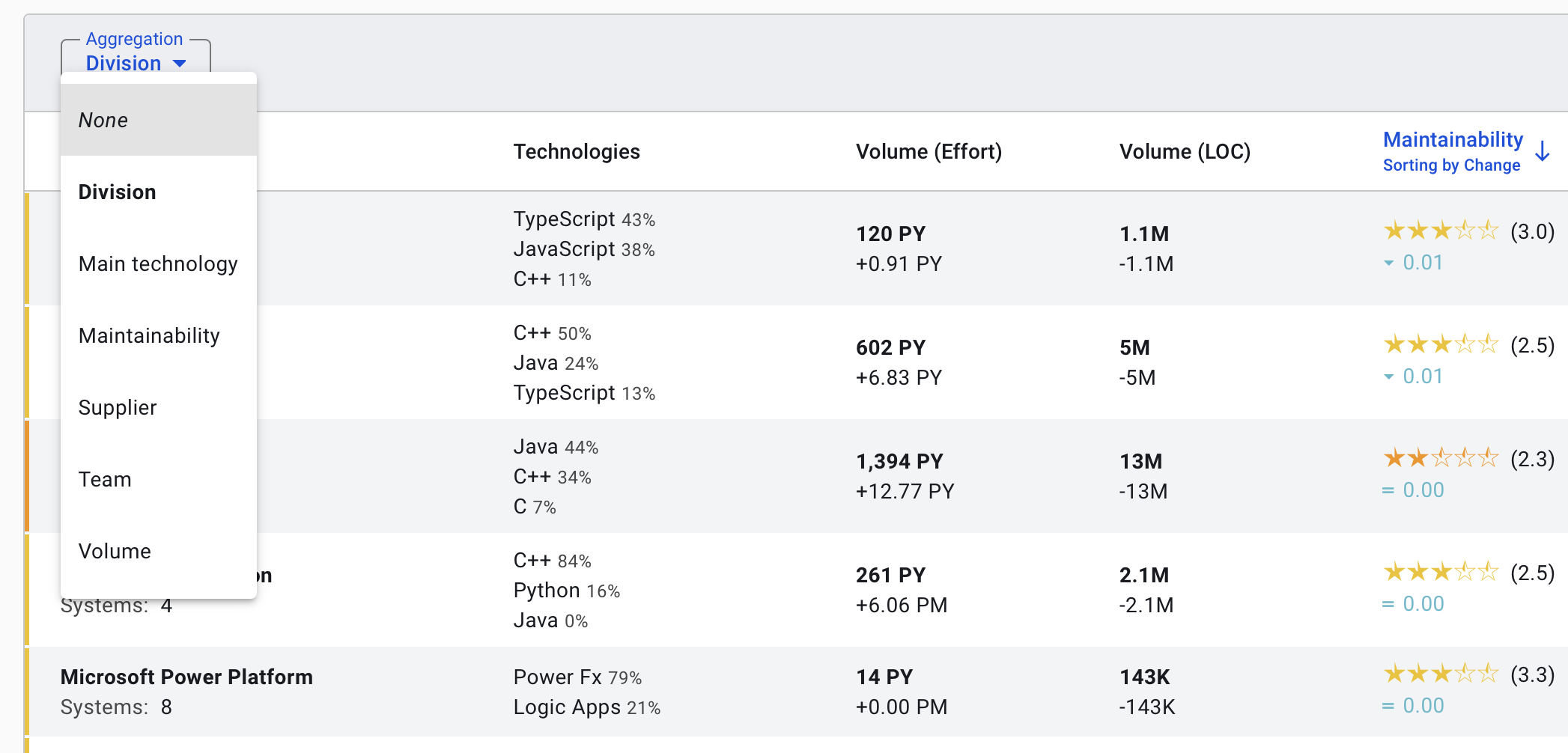
Aggregating maintainability ratings
By default, the maintainability dashboard will display information per system. However, in some cases you might be more interested in aggregating information, for example for reporting purposes. You can use the “aggregation” menu to change the appearance of the dashboard. For example, selecting the aggregation option to “supplier” will report the aggregated volume and maintainability information per supplier, instead of reporting this information for each invidual system.
Delta quality view
The Delta quality view shows the impact of code changes on the entire portfolio for the selected period. By default it shows you “New code”, the first of three tabs. In the treemap the results are grouped per system. Just like other Sigrid pages, the characteristics can be changed by their drop-down menus (here:”Color”, “Area”, “Grouping” and “Annotations”). So note that the summaries in the top tiles adjust to whether you have selected “New code”, “Changed code” or “New & changed code”.
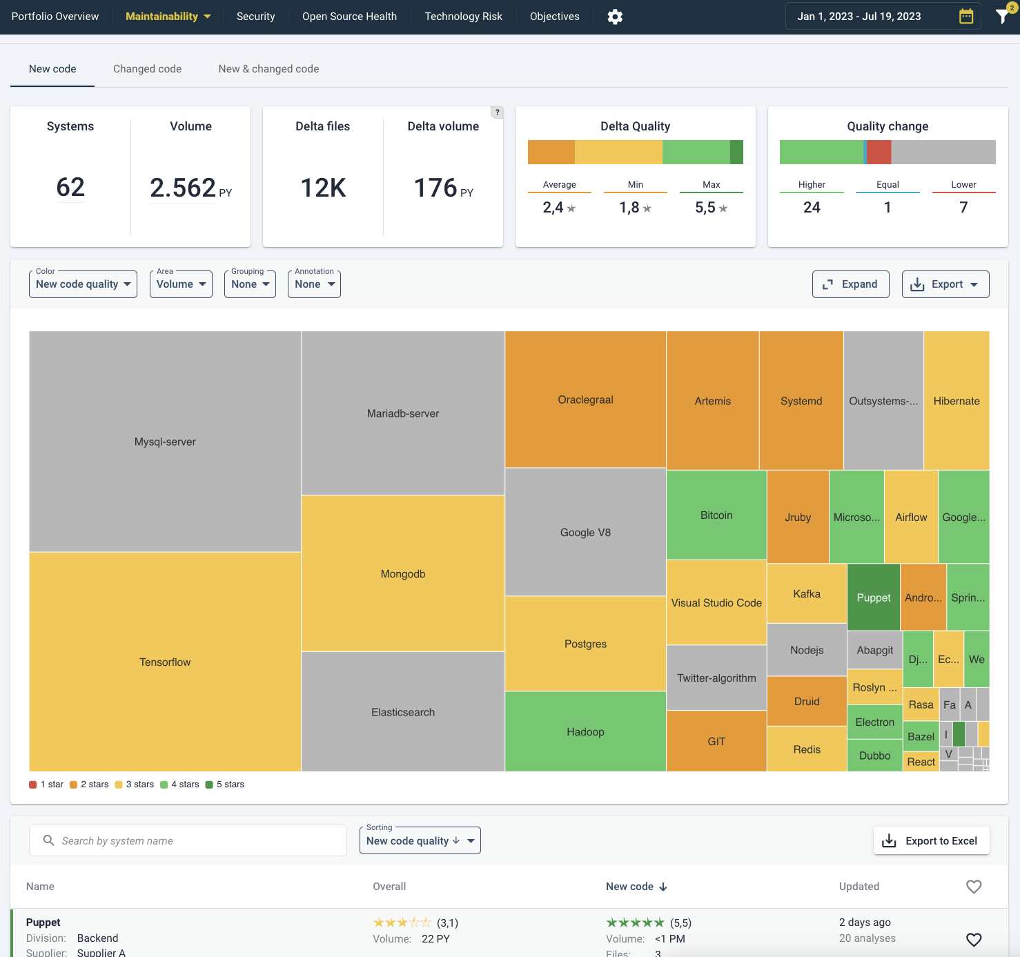
By clicking on a system, either on the treemap or the list below, you will move to the system view for Delta Quality in the same tab as you are viewing now (“New code”, “Changed code” or “New & changed code”). Please see Delta quality on a system-level for elaboration on system-specifics. Generally, the “New code” delta tells you whether new developments are able to follow best practices (assuming that code change heuristics picked up those files correctly as being new, as opposed to moved or renamed). The impact of “Changed code quality” really depends on the size of the change. If 1 line of code has been changed, the code quality will probably stay the same. If that happens to be (older) code with lower quality, it is not necessarily alarming. A more balanced view will be visible in the “New & changed code” tab, which averages out changes to new and existing code. A sanity check is to see whether portfolio-wide metrics have actually changed (in the Maintainability Overview tab, see above).
 With the help of the top right funnel/filter icon, the information can be filtered and sorted by metadata (such as supplier, team, or division). By default it shows (2) active filters: “Hide excluded systems” and “Hide deactivated systems”.
Please see the system-level overview page under Maintainability:4 for elaboration.
Maintainability benchmark
The top-level “maintainability” menu contains the SIG maintainability benchmark view. This view will depict the systems in your portfolio, relative to the thousands of other systems in the SIG benchmark.

In this visualization, the horizontal axis represents the system volume in person years, and the vertical axis represents the maintainability star rating. Each dot represents one of the systems in the SIG maintainability benchmark.